Home Museum, App
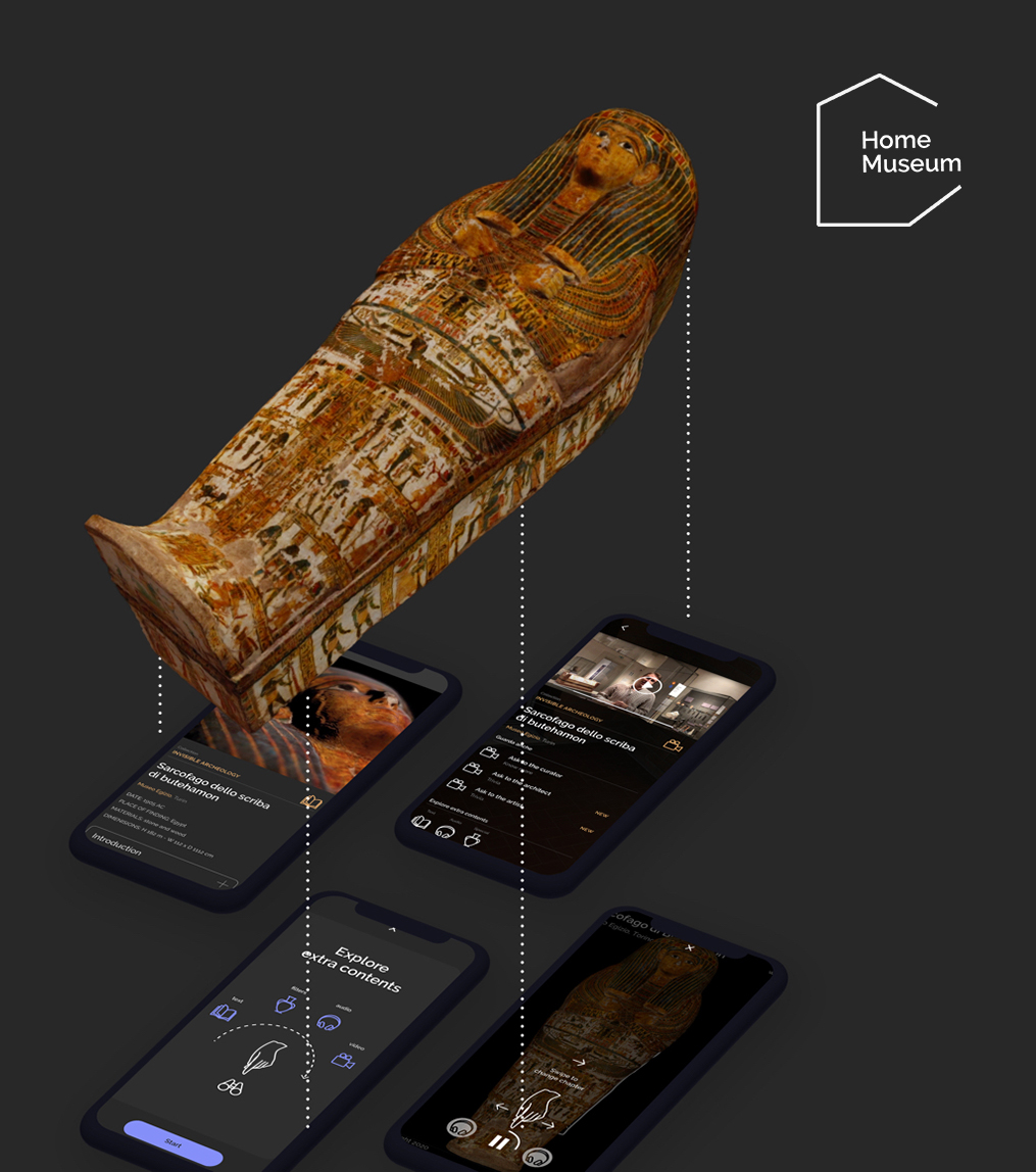
“Home Museum” is an interactive Augmented Reality app that allows users to create a virtual museum or gallery in any room of their home or school.
Main Role
Lead Designer
UX/UI Design
As part of the Team
Robin Studio
Area 3
In collaboration with
Museo Egizio – Turin
Mission
The idea was born to support museums around the world, creating an engaging digital experience for people at home along with the aim to promote exhibitions and art collections that were closed during the lockdown.
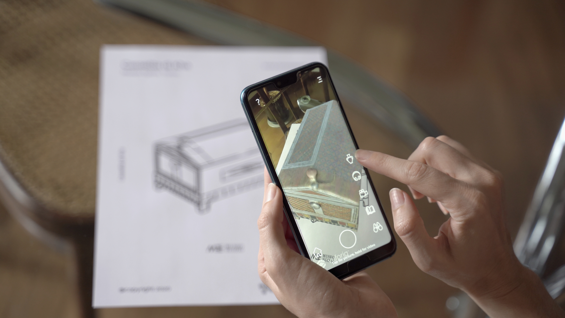
How it works
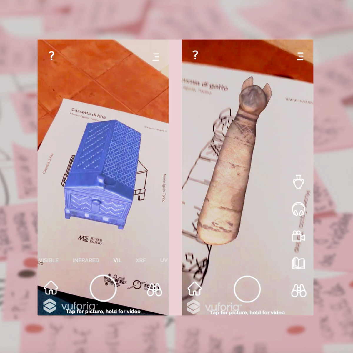
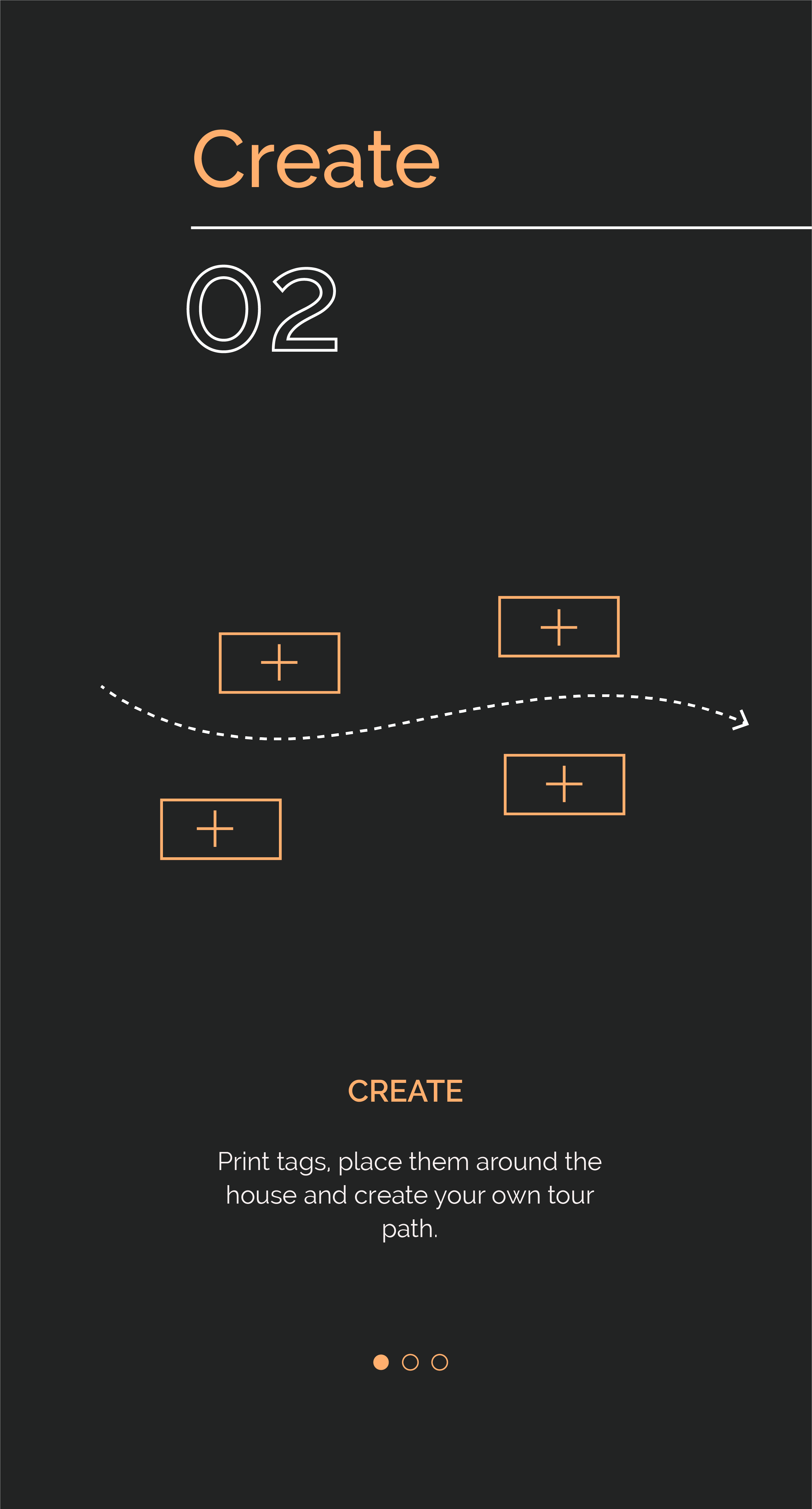
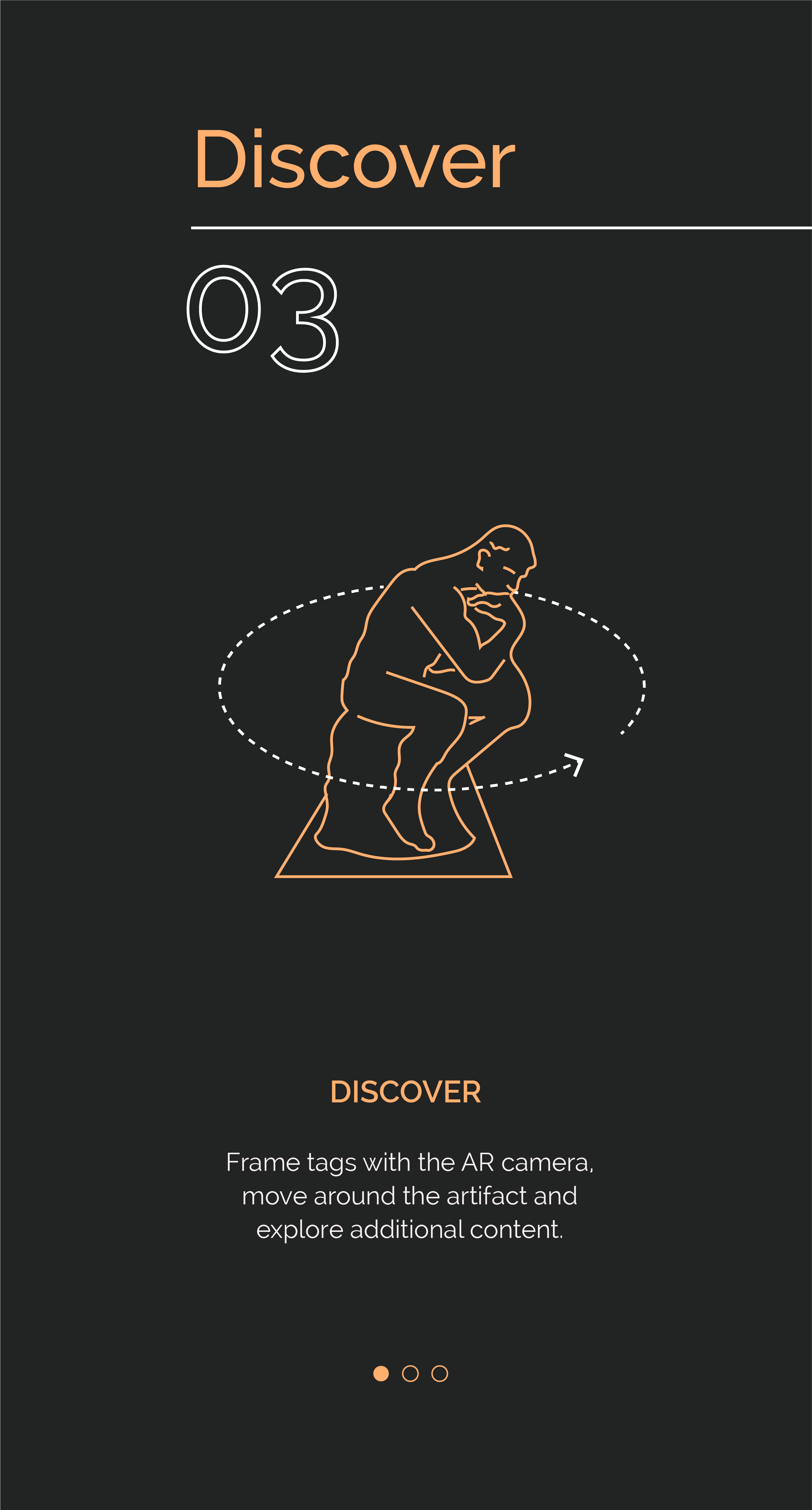
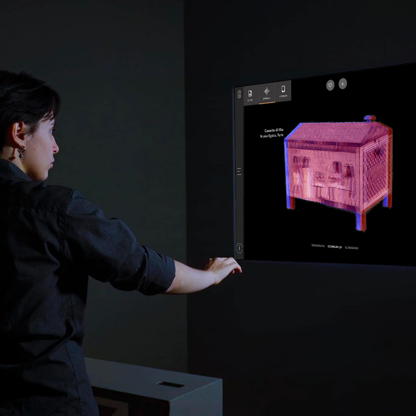
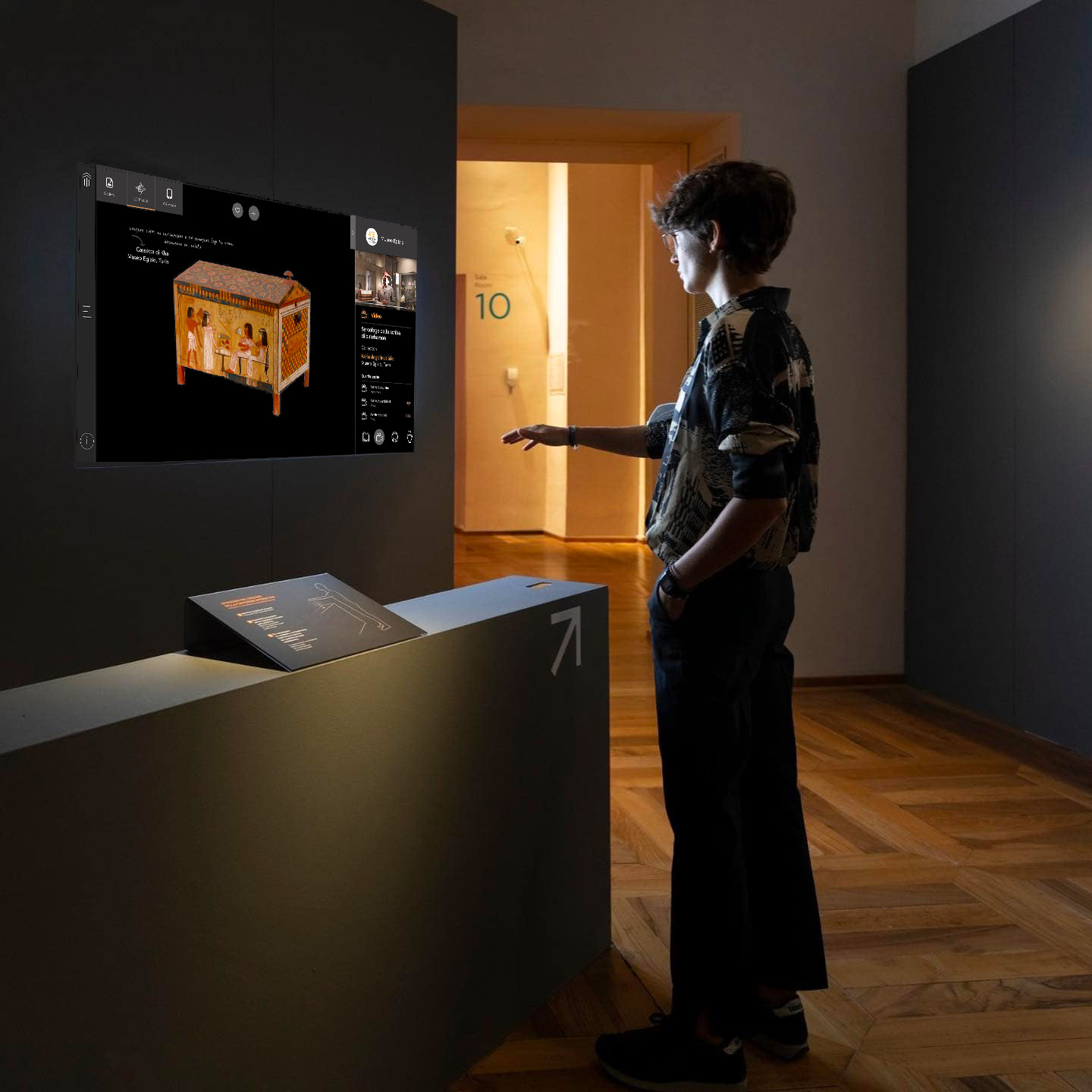
Through printed targets, the user can create a path at home or school and can give life to the personal gallery thanks to the augmented reality function that allows visualizing in the space 3D models and extra contents.
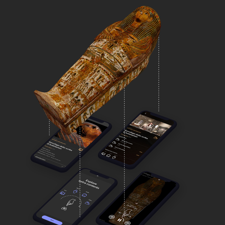
Main Features
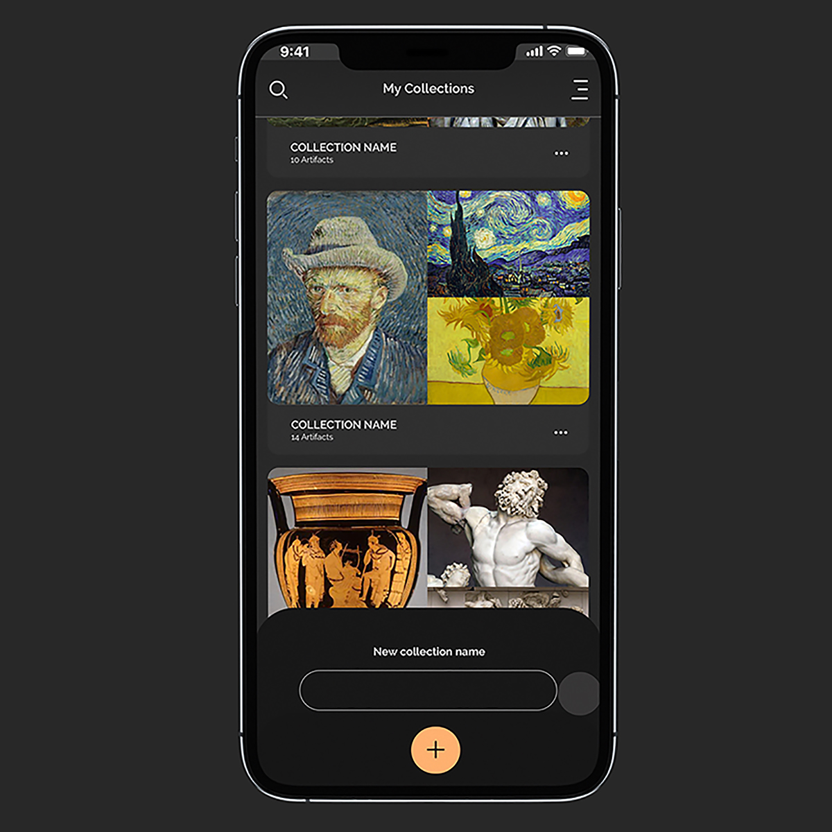
The app allows you to relive the past, experience the future and learn more about works of art, relics and findings through the audio guide, videos, interactive contents and 3 levels of user experience.
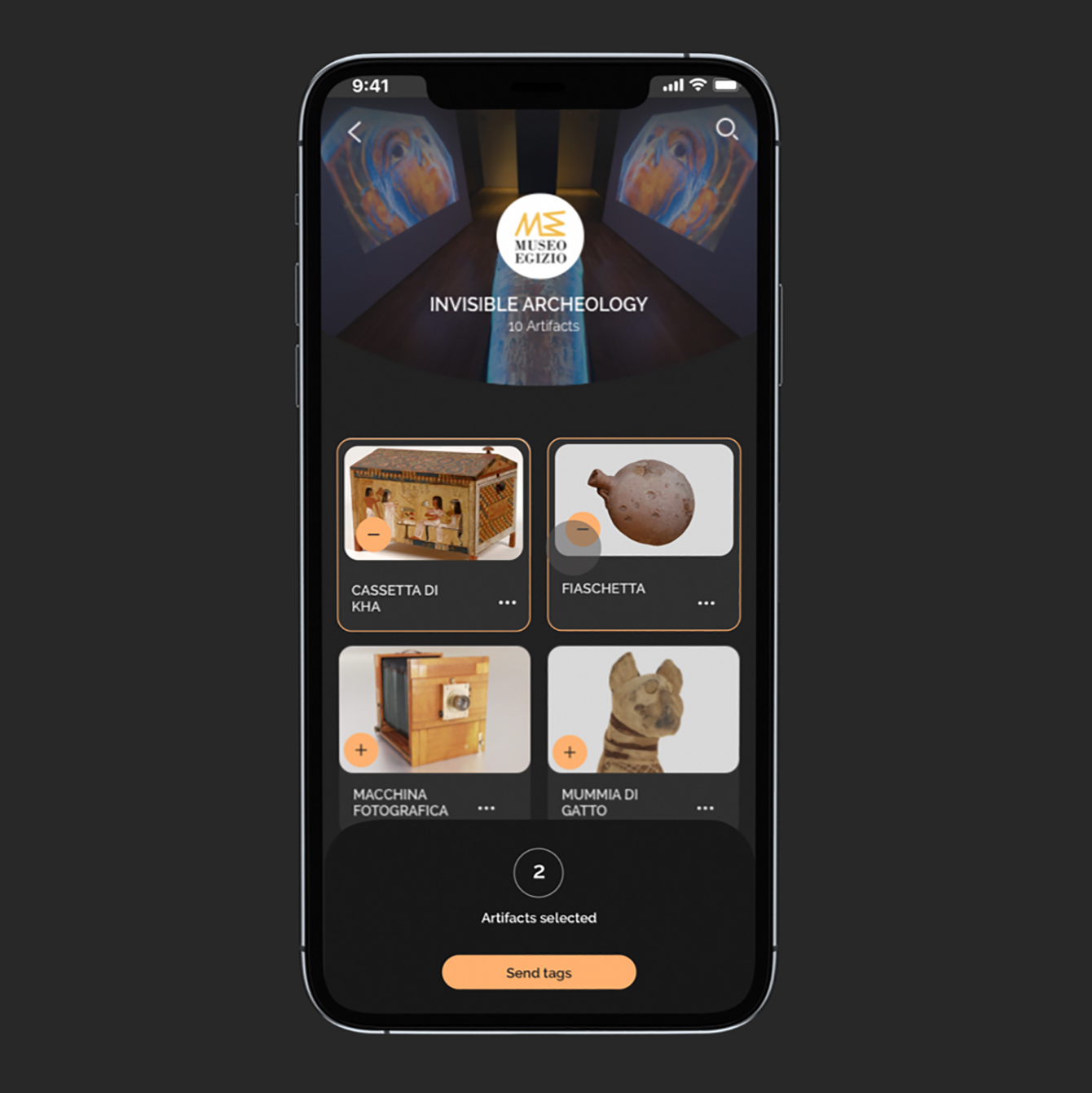
Database Architecture
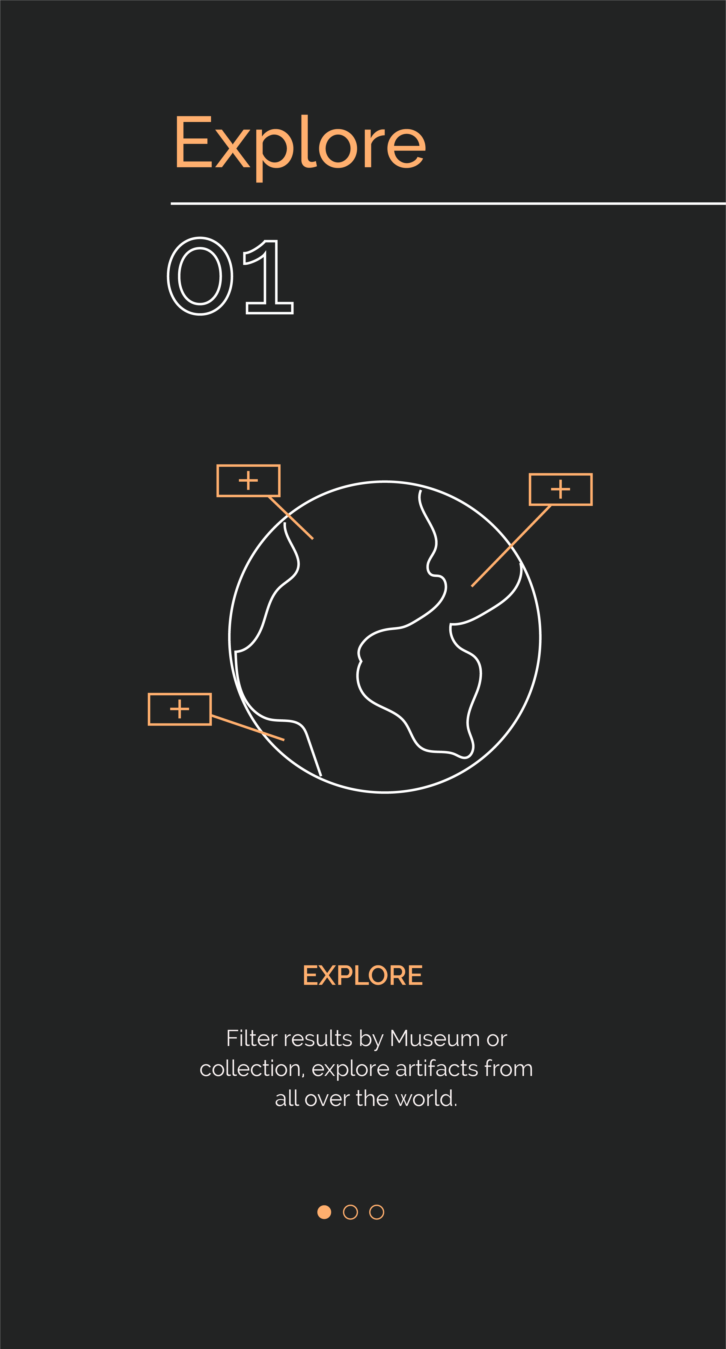
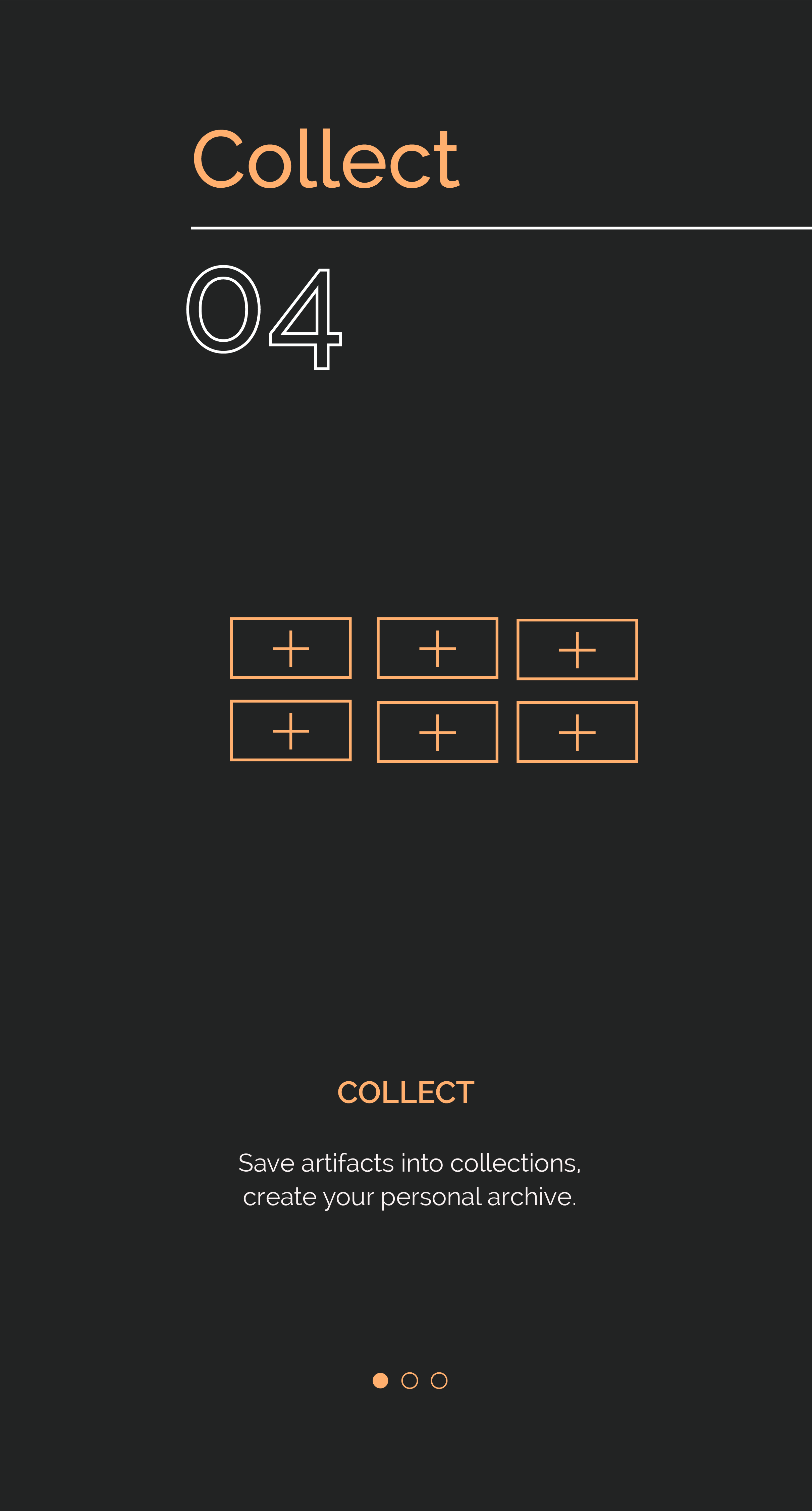
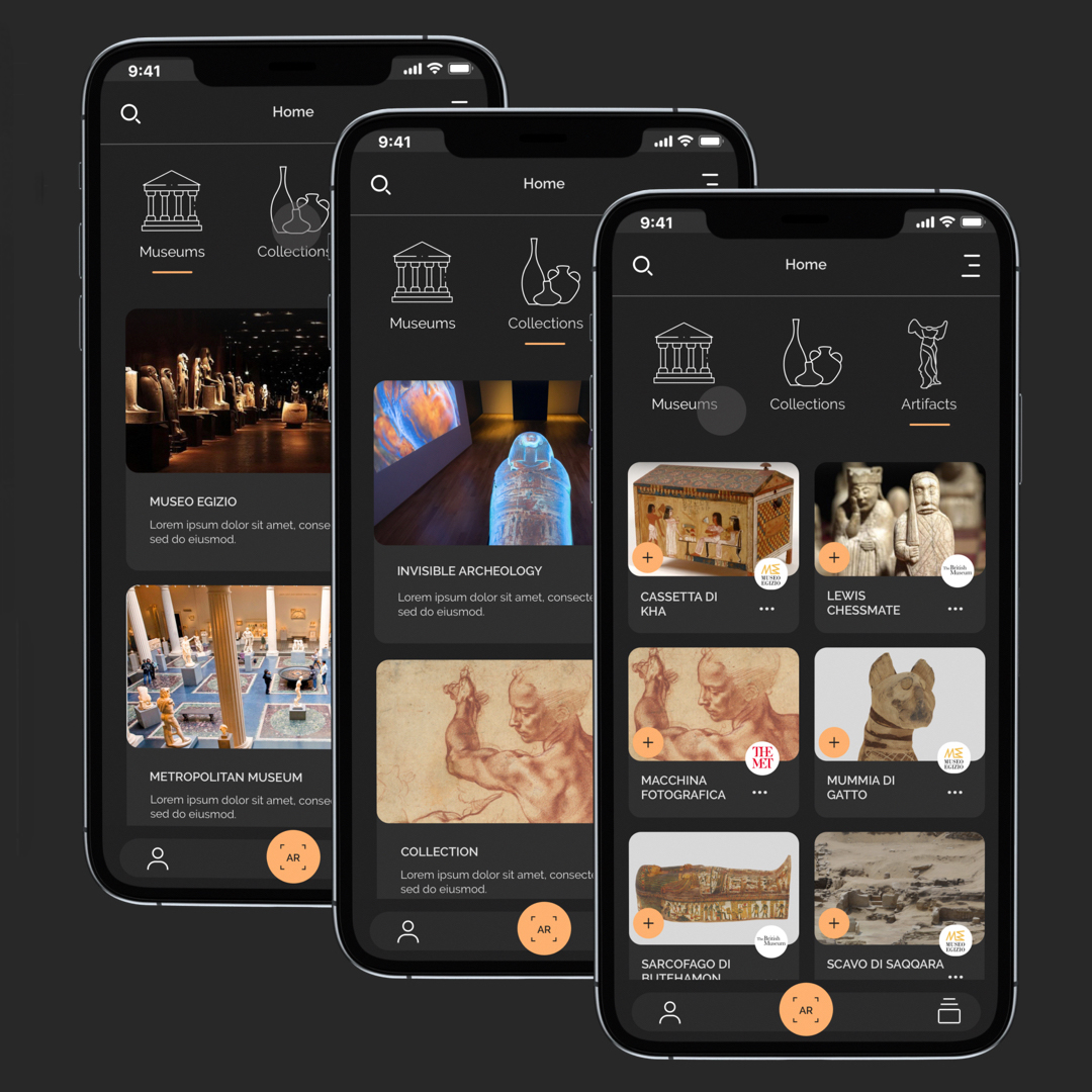
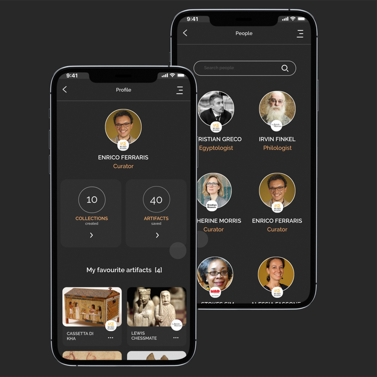
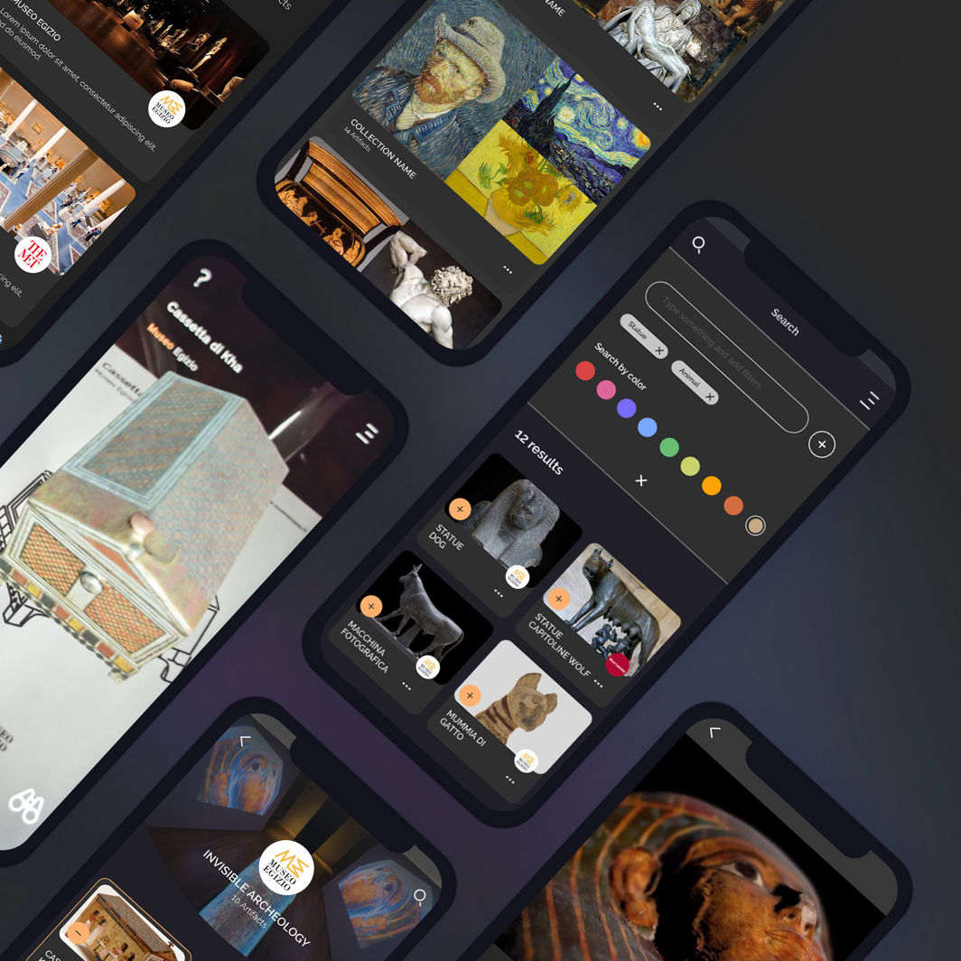
A huge archive to learn and connect people. The app allows you to navigate the content through lists of artifacts suggested by theme, popularity and interests. The database architecture concept is based on an advanced search model that works following the interests and behaviour of its user. You can also explore collections created by curators, art historians and gallery owners and have the chance to connect with them.
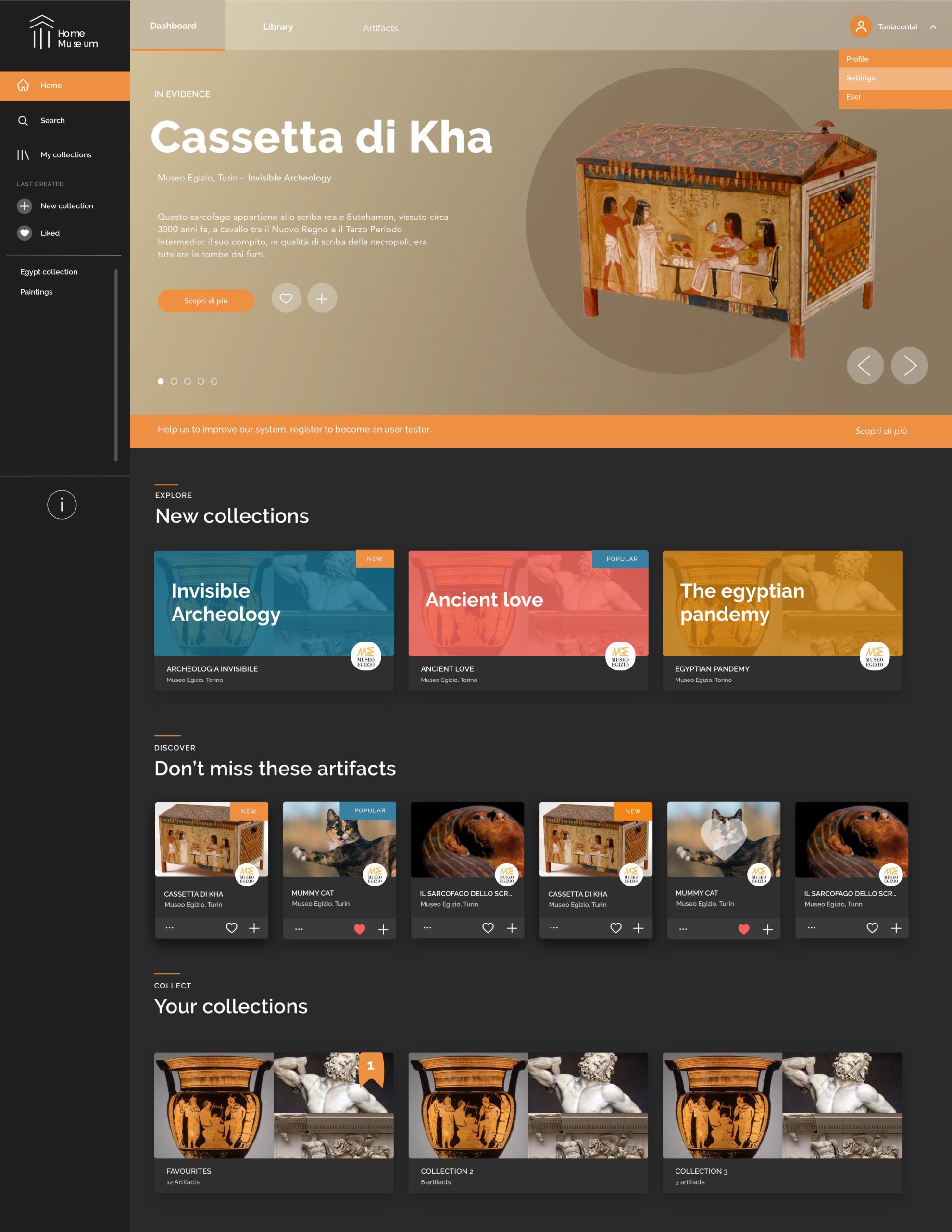
Web App
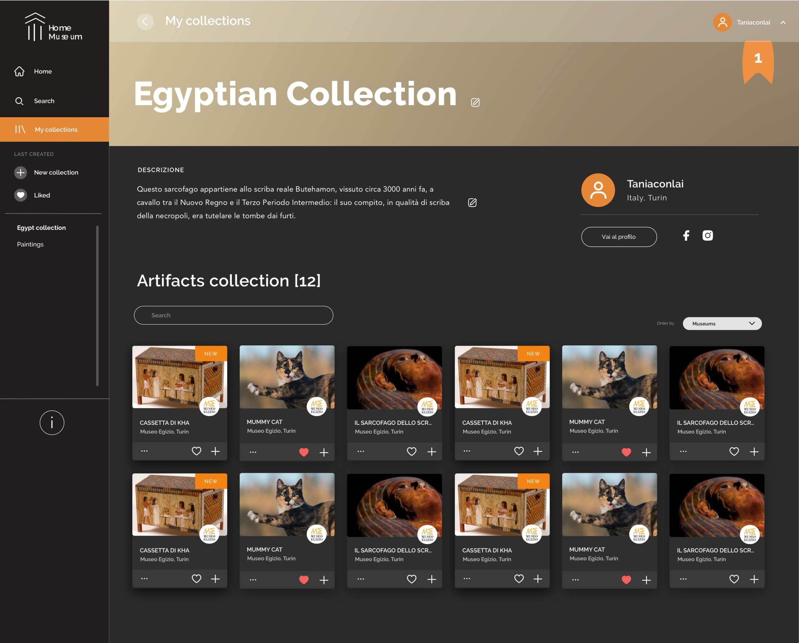
Following a marketing strategy, the launch of the product was planned to be released with a sister product, the web app. The concept of design followed one question: what if the web app looks and works like Spotify, but instead of collecting and listening to music you are collecting and experiencing Art and Heritage?
Educational Experience
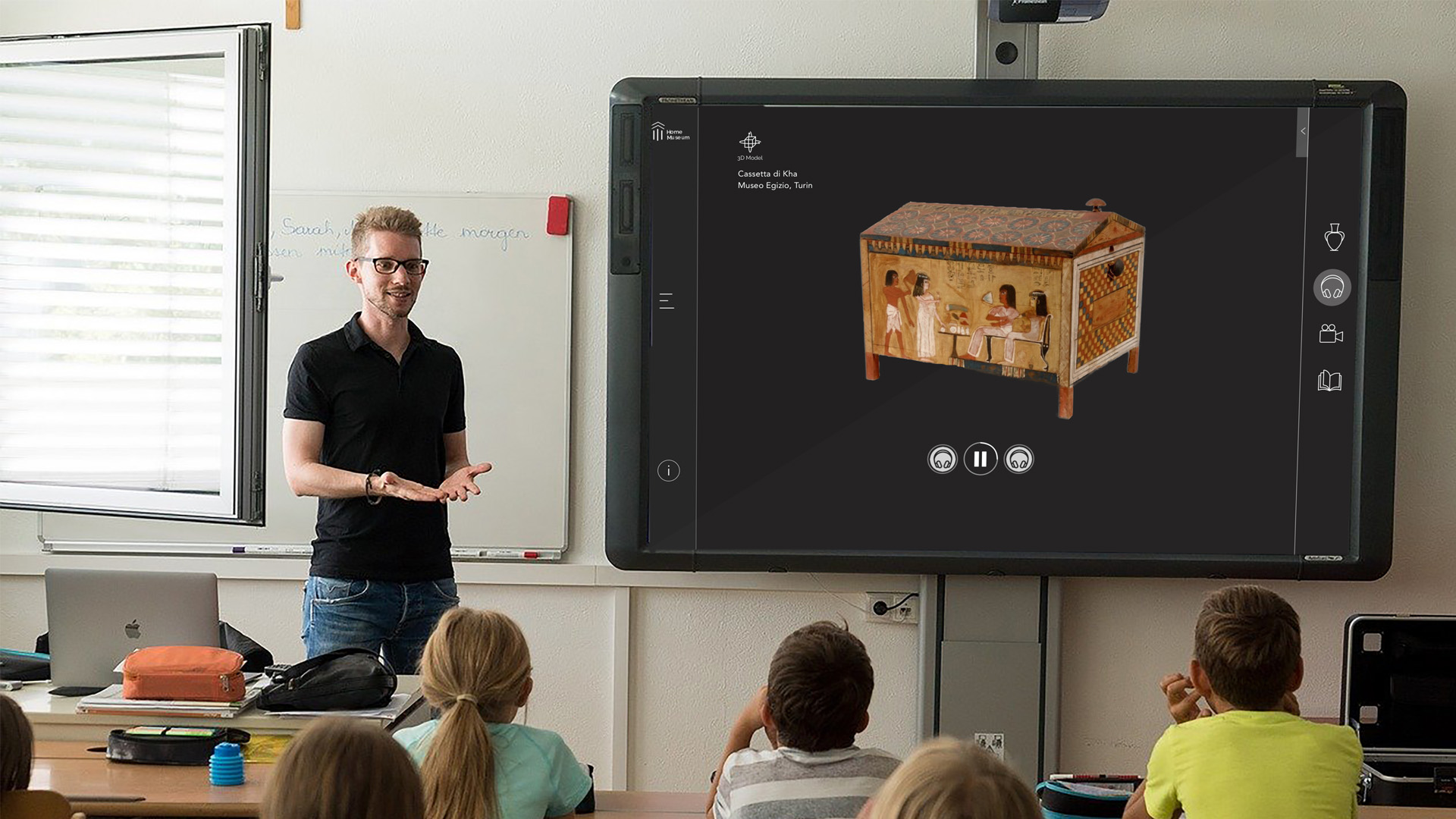
When it comes to Museums you can’t exclude the huge impact on the educational experience. The AR and VR ambient of Home Museum is a transferable asset for school classes and on-site experiential exhibitions.
Design Process
From concept to the beta version we run through the best practices of the design process and build a team including 6 different experts.
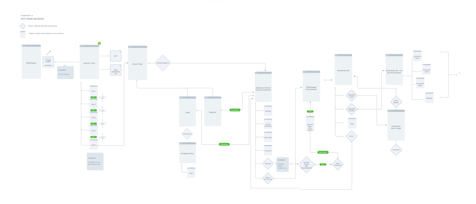
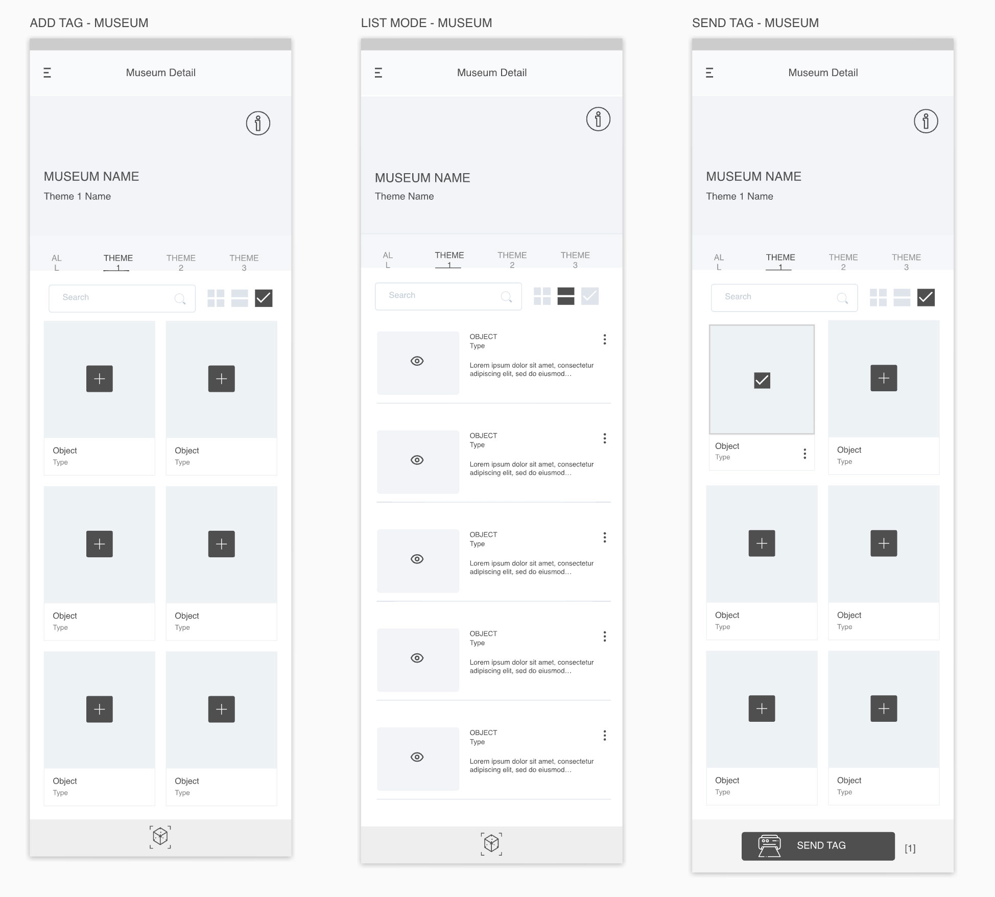
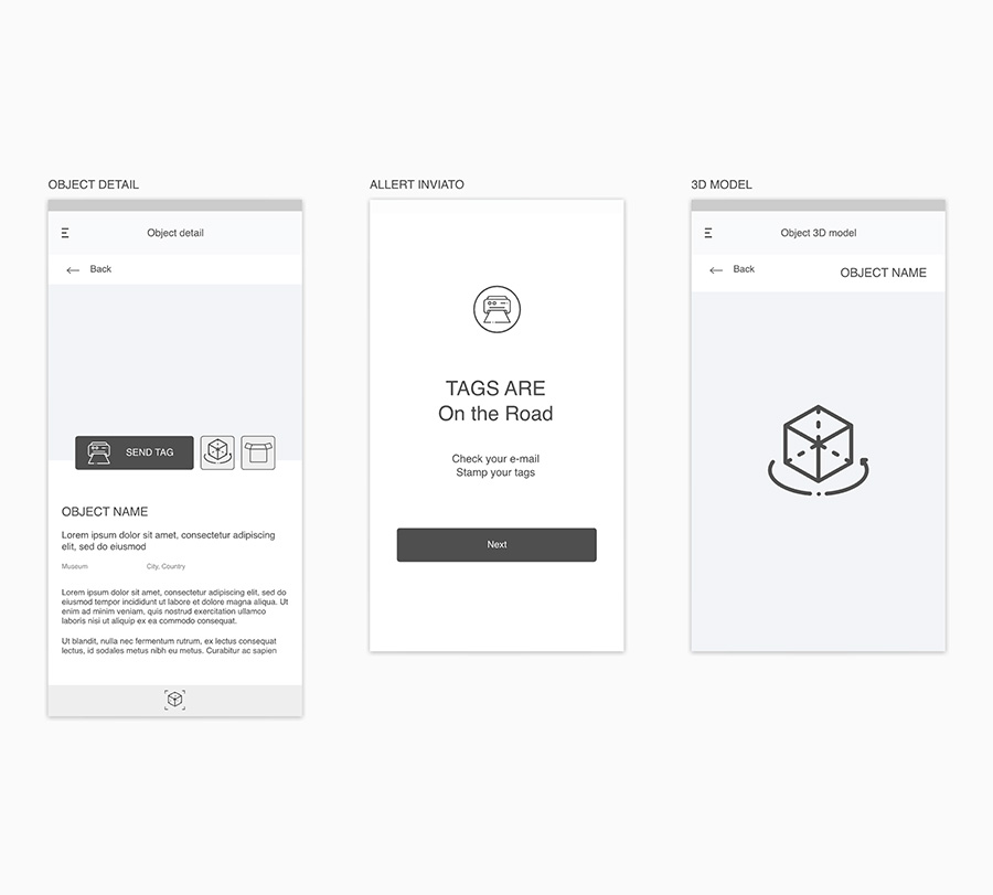
The initial research was made to define the value, positioning among competitors and main target to reach. Once we defined the roadmap and the main functions to include in the first version, the first step as a designer saw me creating a flow chart to define the main user journey. A low-fidelity prototype followed the initial design step.
Flow Chart
Low-fidelity prototype
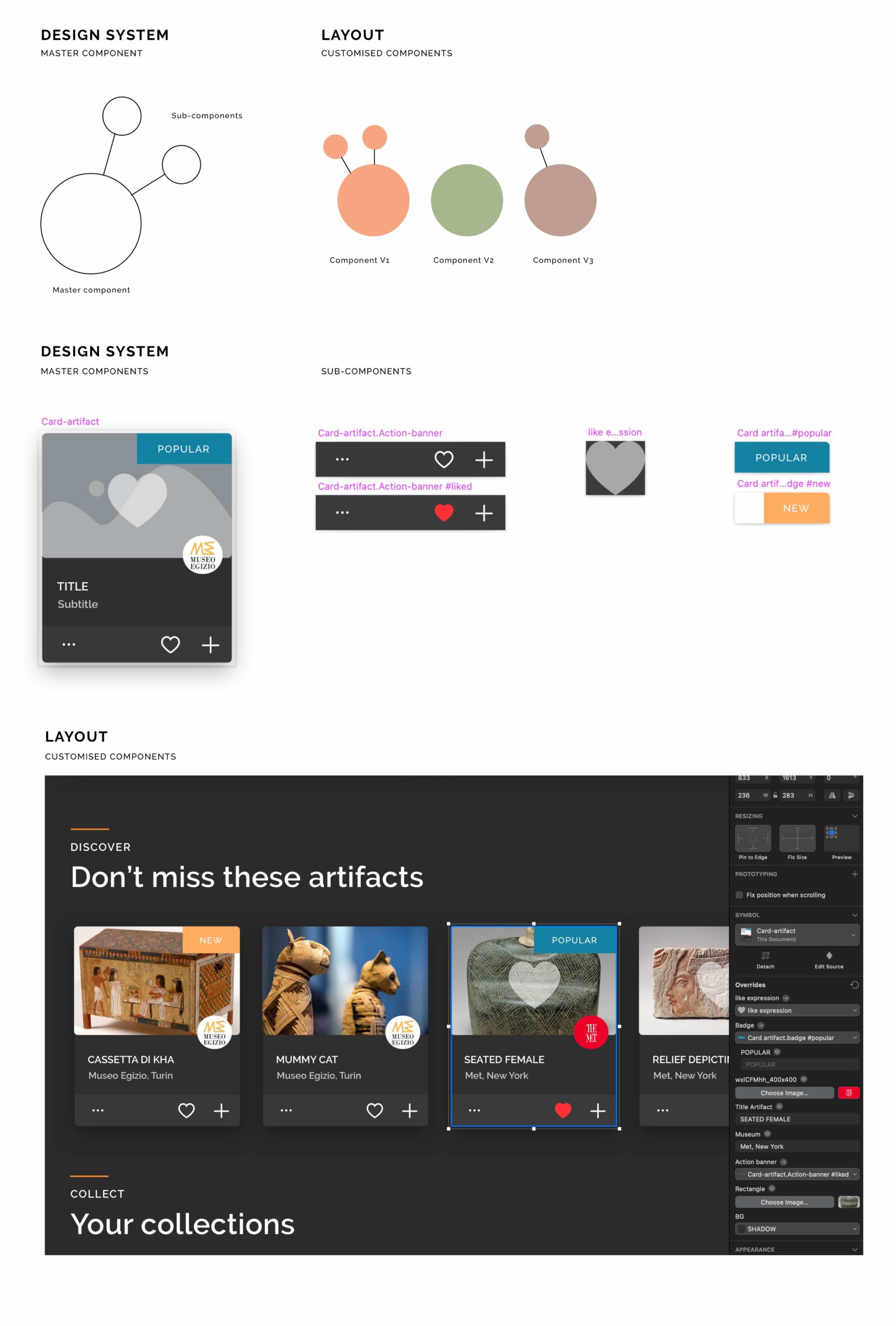
Design System
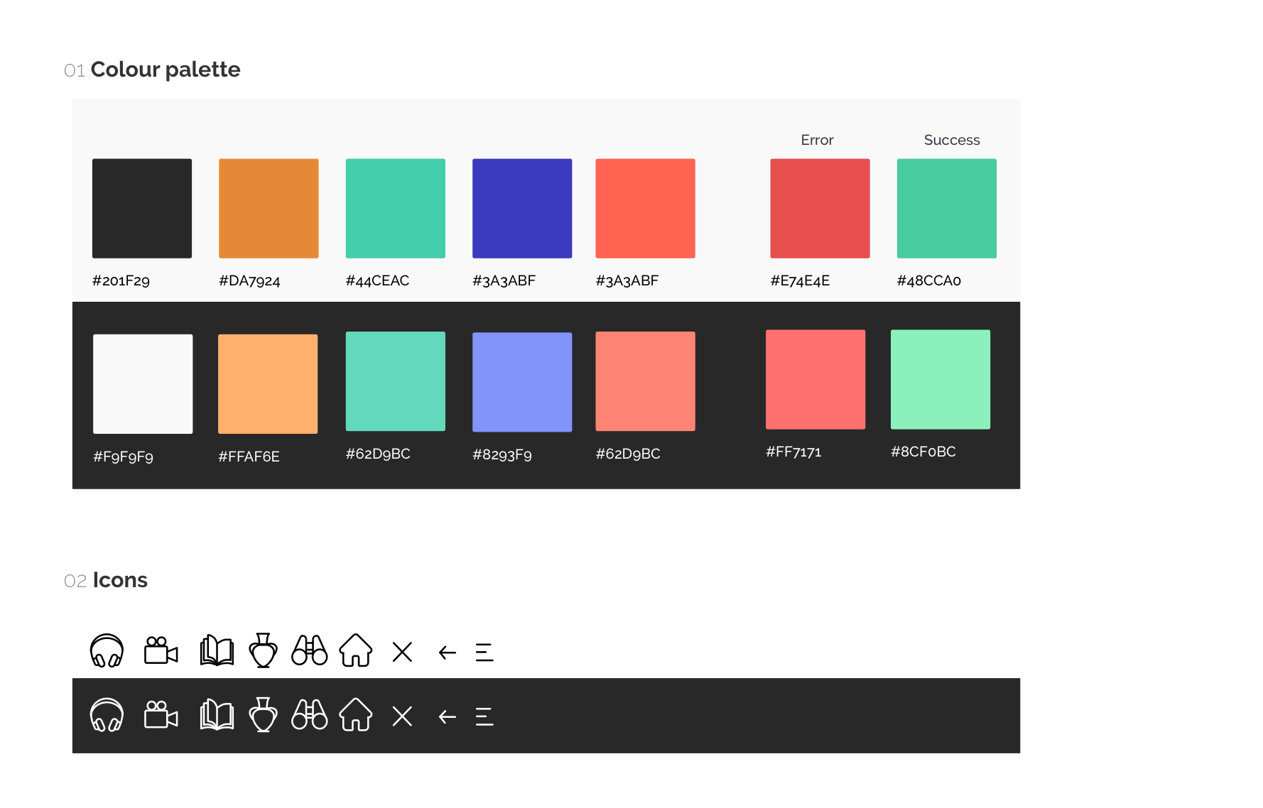
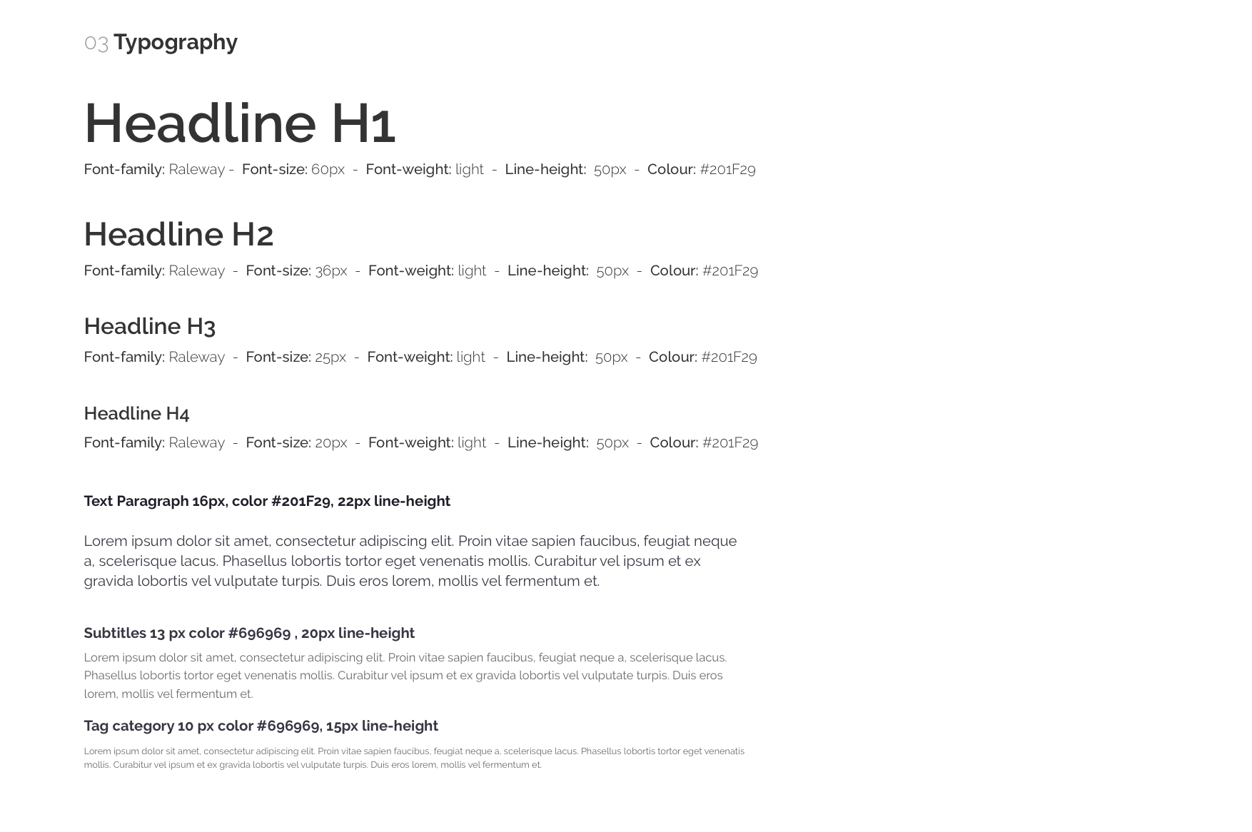
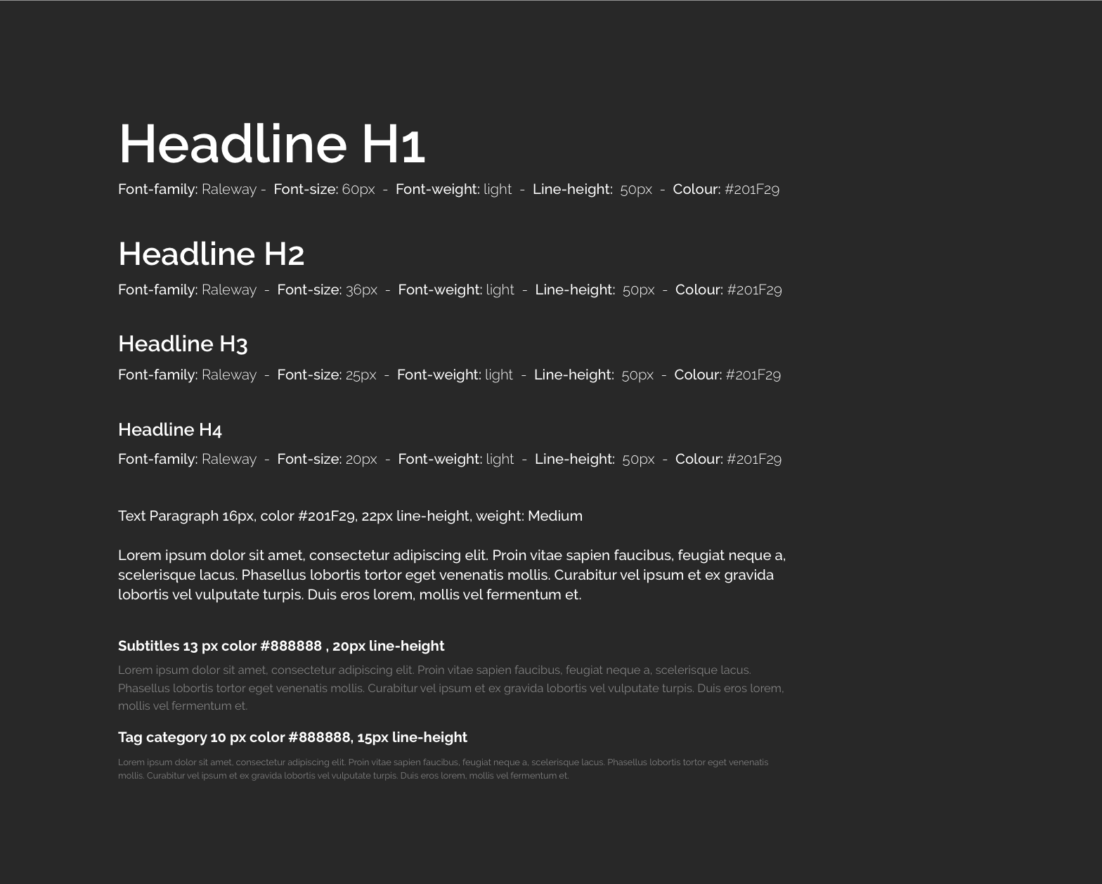
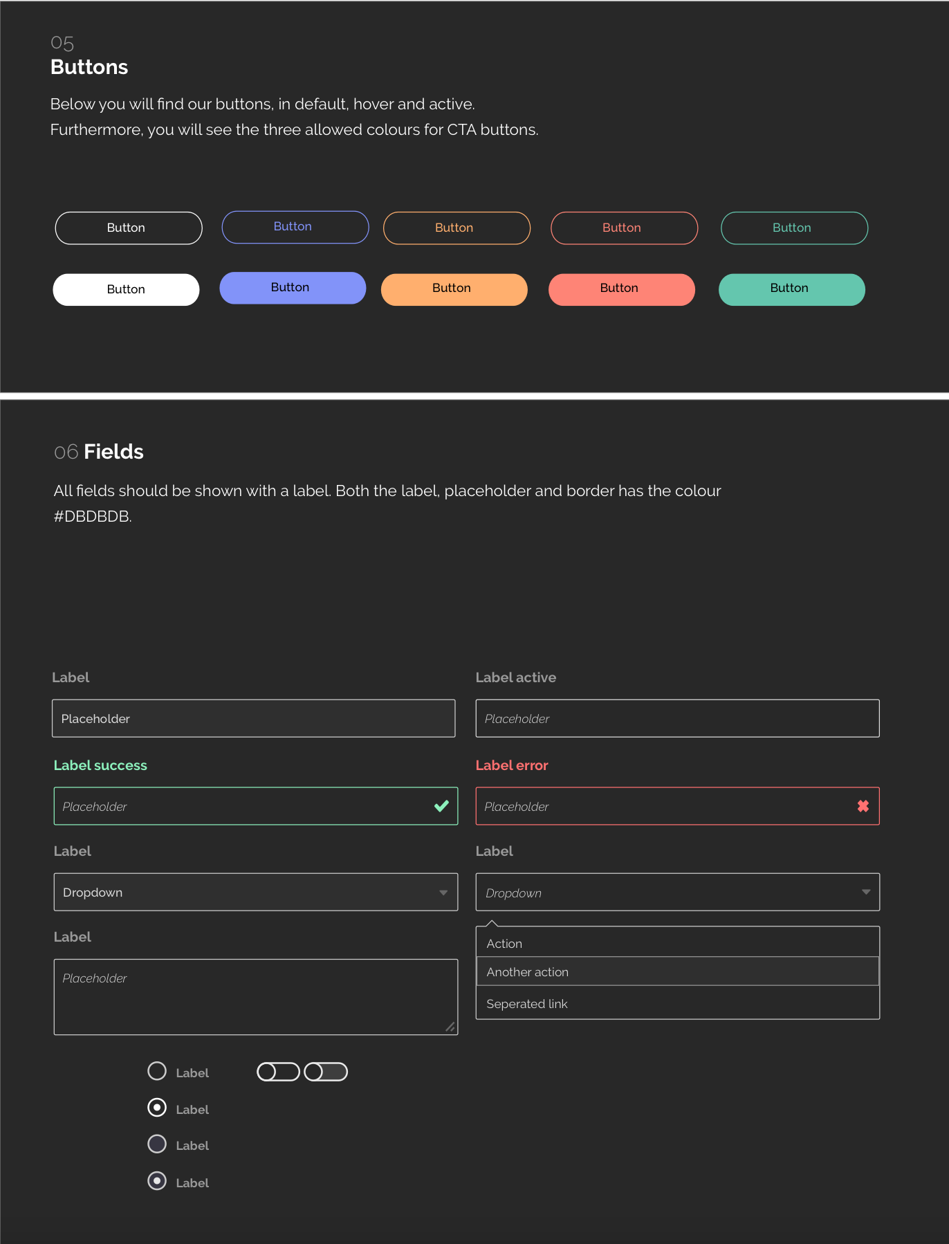
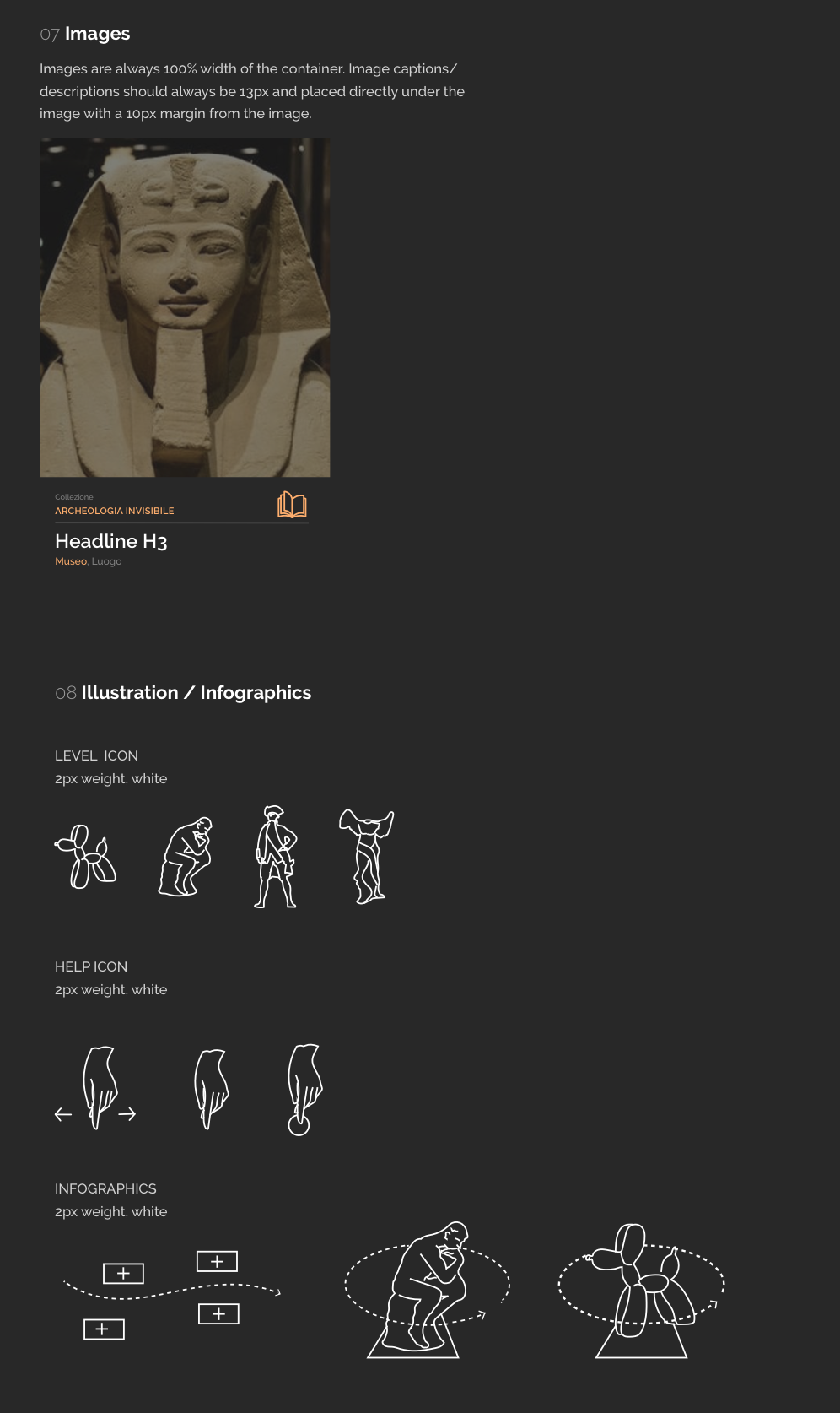
The style guide inherited from the brand identity study was built to define the colour system, font hierarchy, imagery, icons, buttons and each complex component, in light and dark modes.
User test
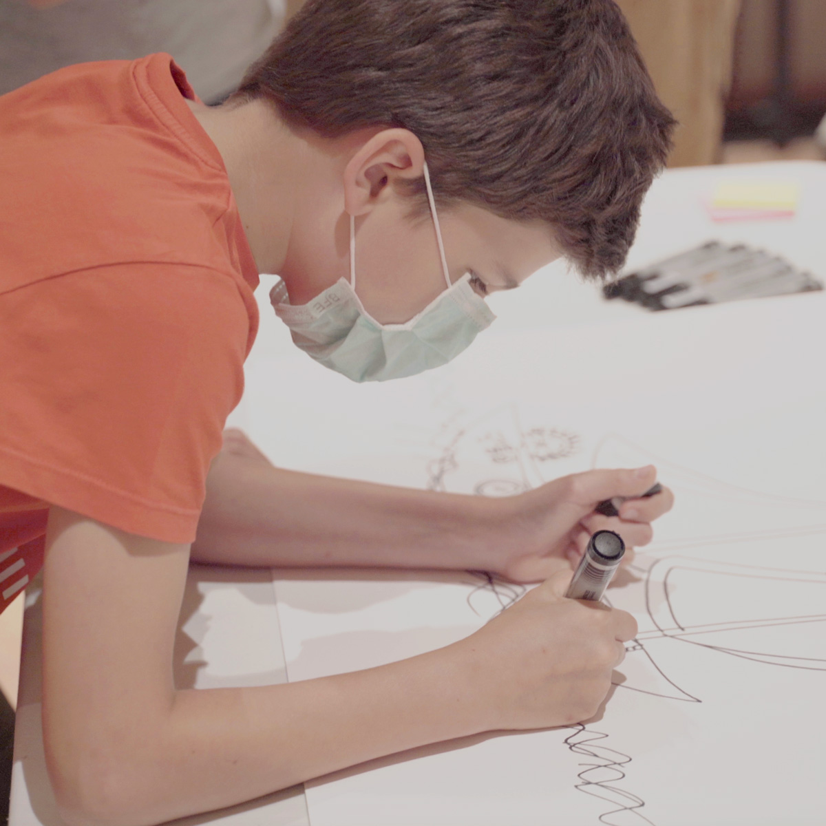
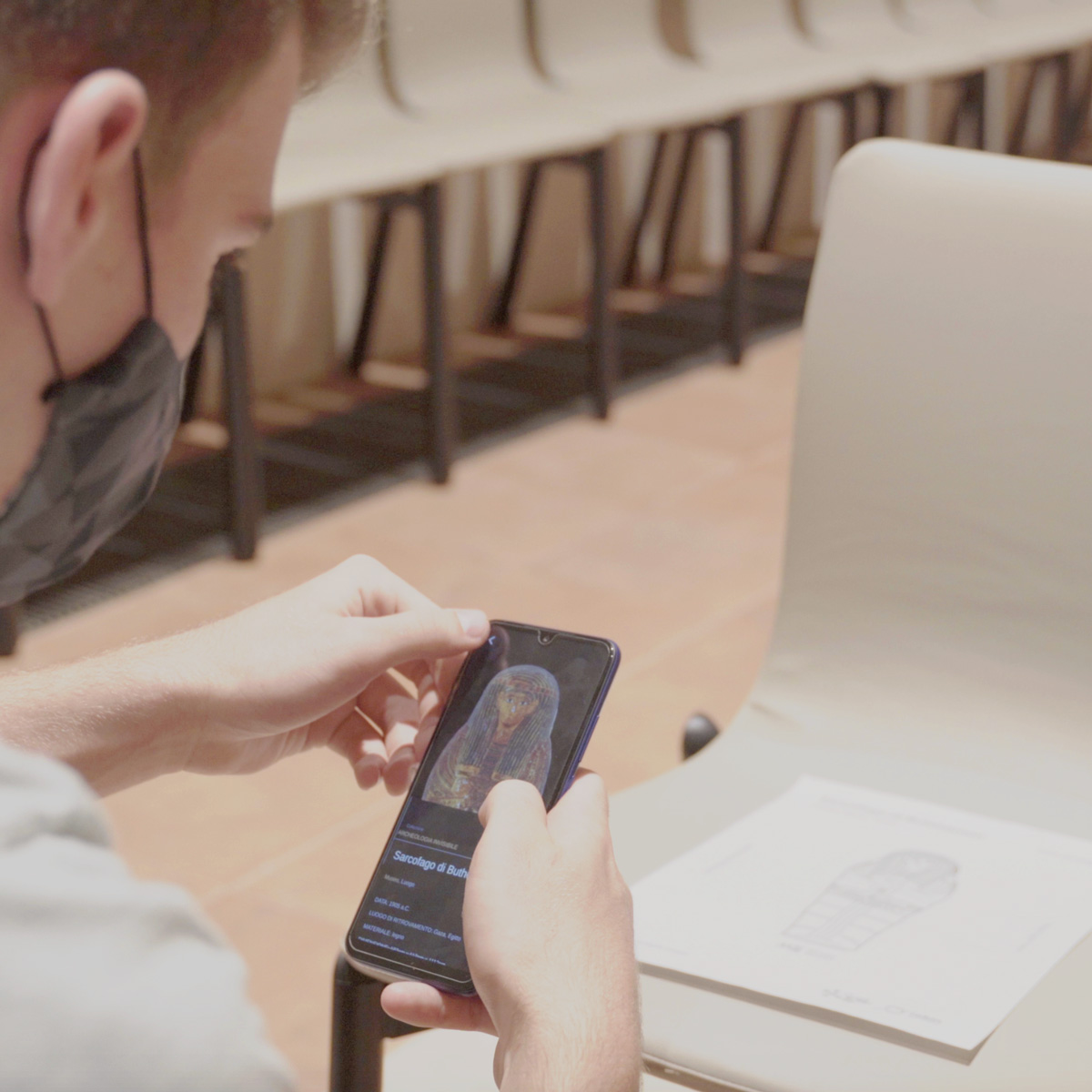
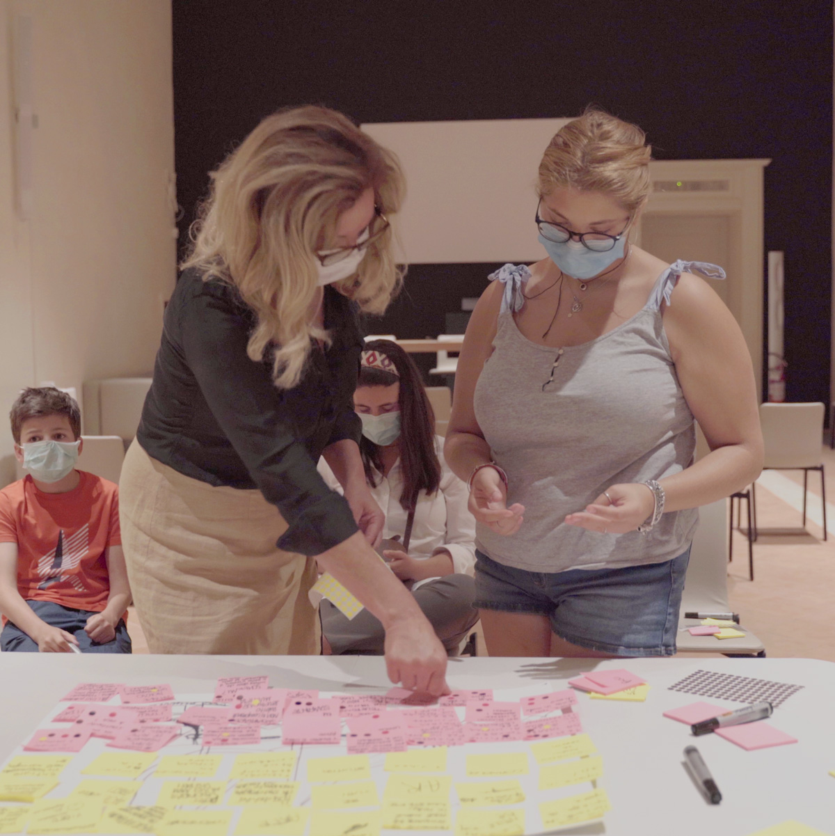
User tests were run with 3 different targets: curators and researchers, teachers, and children (from 11 to 18 years old).
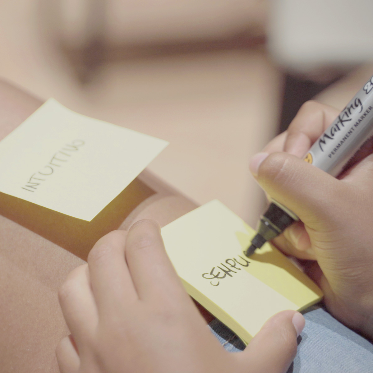
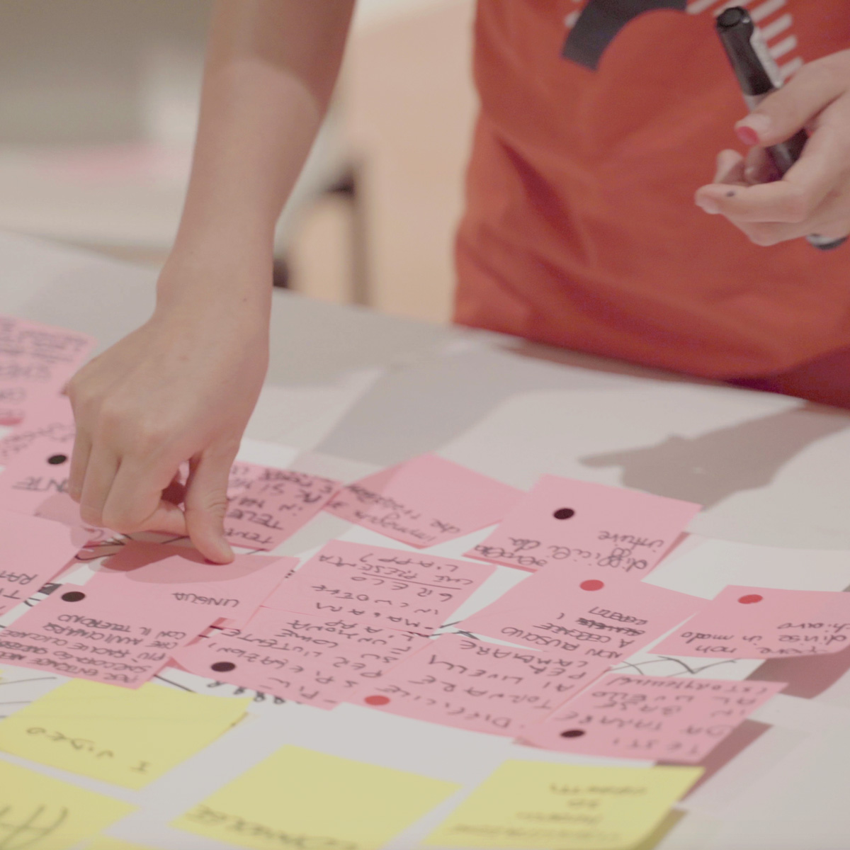
The testers used the application with total autonomy and in an isolated environment, in order to not influence the user experience. At the end of the day, we set up a design thinking workshop for children to turn the most critical points of their experience into solutions.
